网格背景
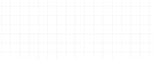
body{
    background-image: linear-gradient(0deg, #eee 1px, transparent 0), linear-gradient(90deg, #eee 1px, transparent 0);
    background-size: 30px 30px;
}
雷达波纹脉冲效果
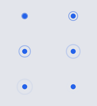
<style>
    .pulse{
        position: relative;
        display: inline-block;
        width: 10px;
        height: 10px;
        border-radius: 50%;
        background: #2563eb;
    }
    .pulse::after{
        content: '';
        position: absolute;
        inset: -6px;
        border-radius: inherit;
        border: 2px solid #2563eb;
        opacity: .55;
        animation: pulse 1.8s infinite ease-out;
    }
    @keyframes pulse {
        from {
            transform: scale(.55);
            opacity: .8
        }

        to {
            transform: scale(1.5);
            opacity: 0
        }
    }
</style>
<span class='pulse'></span>